How to Choose the Right Color Combinations for Team Kits

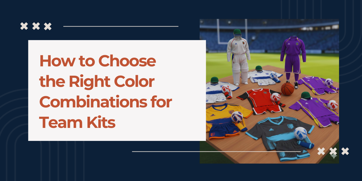
When you think of the representation, you do not just get the best features in uniform. You need the best color combinations for team kits that go beyond mere aesthetics. Colors have a significant influence on visibility and team identity, and can even impact brand recognition.
Whether you are designing kits for a local school sports uniform or a professional one, you need to be thorough with the colour scheme and its impact on the team’s presence on the field and unity.
The right combination is not just the one that looks good to the eye, but also the one that tells a story that reveals a team’s confidence and intentions. Pairing the right colors with moisture-wicking sports clothes ensures athletes stay comfortable and perform at their best throughout the game.
Factors To Consider When Choosing Team Kit Color Combinations
When deciding on the best color combinations for team kits, consider factors that directly impact the appeal and comfort of the team. Uniform suppliers in the UAE can help ensure your team kits combine style, visibility, and performance effectively.

1. Understand the Team’s Identity and Values
So, how to pick colors for team kits?
Before choosing the right colors for team kits, consider how you want to represent your team. It can be about the identity related to their heritage, location, values, or a competitive mindset.
Colors need to convey everything and send a visual message. For example, if you choose red, it often sends the message of energy, aggression, and passion, while blue is calm and disciplined enough to crush you when needed. Green may be a colour of growth, but in sports it can convey resilience, and black indicates where authority lies.
If the team already has a logo or brand, the kit colors must align with it across the jerseys, training wear, merchandise, and digital assets to convey professionalism.
2. Prioritize Visibility and Contrast
Visibility is really important and goes beyond just looking good in design. Players must stand out from their teammates, opponents, referees, and even the background and custom sports uniforms are important for it. Using colors with strong contrast makes everything clearer, especially when the action gets intense.
For example, if you use a dark color as the base and add light accents, it really helps with readability for things like numbers, names, and sponsor logos.
You definitely want to steer clear of color combos that blend into common backgrounds, like using green on green in outdoor fields or light gray on white under stadium lights. Good contrast is key to performance, safety, and ensuring everything looks clear on broadcasts.
3. Balance Primary, Secondary, and Accent Colors
Well-designed kits, even for sports uniforms wholesale, usually have a clear color hierarchy. The main color is the star, covering the jersey and shaping the overall appearance. Then you’ve got secondary colors that enhance the design through elements like sleeves, side panels, or the shorts. Lastly, accent colors provide those sharp details in things like trims, logos, or numbers.
When you’re picking colour combinations for team kits, try to stick to two or three core colors. Using too many shades can make the design feel cluttered and less impactful. Keeping it simple with a limited color palette makes the kit look neat, professional, and easily recognizable. Remember, never compromise on the best fabric for sportswear.
4. Consider Psychological Impact on Performance
Color psychology is actually pretty interesting when it comes to sports. There’s research showing that specific colors can shape how we see things and how we act. Teams that go for darker or bolder shades tend to come off as more aggressive or dominant, while lighter colours can convey a sense of agility and speed.
That said, just wearing a specific color doesn’t guarantee success. But if a team chooses colors that match their mindset, it can really help boost their confidence. For youth teams, bright and energetic colors can lift spirits. On the other hand, elite or corporate teams might stick with more refined color schemes to project authority and confidence.
5. Account for Cultural and Regional Sensitivity
Colors have different meanings depending on the culture or region. Something that stands for victory or pride in one place might mean mourning or caution somewhere else. So, when you’re designing kits for international teams or world tournaments, it’s really important to look into the cultural meanings behind those colors.
Also, national and regional colors can pack a lot of emotional weight. Using them wisely can really strengthen the bond fans feel and boost community pride, all while keeping the design balanced.
6. Ensure Longevity and Timeless Appeal
Sportswear trends come and go, but a good kit should last. Those super trendy colors can feel old pretty fast, sometimes just after a season or two. Sticking with classic combos like navy and white, red and black, or royal blue and gold is a smart way to keep your look fresh for longer.
This matters even more in custom sportswear printing for teams that wear the same kits over several seasons or rely on merchandise sales. Those timeless color combos for team kits really help maintain brand value over time and cut down on the need for constant redesigns.
7. Adapt Colors for Home, Away, and Alternate Kits
Most teams need a few different kits. The home kit usually showcases the team’s main identity, while the away and alternate kits offer a chance for creative flair. That said, they should still relate back to the main color scheme.
Keeping consistent accents or recurring signature colors in all the kits helps maintain the brand’s identity and prevents color clashes on the field.

Conclusion
Choosing the perfect color combinations for team kits is essential for team identity, visibility, and performance on the field. Silver Thread UAE, a trusted uniform manufacturer in the UAE, helps teams design and produce high-quality sportswear that balances aesthetics with functionality.
Whether you want to buy customized uniforms in the UAE for schools, clubs, or professional teams, selecting the right palette ensures your athletes stand out, feel confident, and perform at their best. Combining strategic colors with premium fabrics and thoughtful design delivers team kits that are visually striking, durable, and timeless.
FAQs
-
How to choose the right color combinations for team kits?
Consider team identity, visibility, contrast, and psychological impact. Align colors with logos and values. Consult experts like Silver Thread UAE to create cohesive and effective team kits.
-
What are the best color combinations for sports uniforms?
Classic combinations like red-black, navy-white, or royal blue-gold work well. Limit to two or three main colors, balancing primary, secondary, and accent shades for a professional, recognizable look.
-
How do colors affect the look and feel of team kits?
Colors influence visibility, team identity, and perception of energy or authority. Bright shades boost morale, darker tones convey strength, and harmonious palettes enhance cohesion and brand recognition.

